User onboarding: building the house as the guests come in the door
When we launched prsnt.app to the public in August 2018, it was a seismic shift in how we brought users into the app.
Until then, we had been in a closed beta. We sought out connections we had in the interior design industry, asked for referrals, scoured Houzz and local lists for people to reach out to–in short, we scrounged up a group of early adopter users by hook and by crook in the earliest days of prsnt, and that gave us a certain advantage in terms of developmental economy; because these people heard and awful lot about prsnt before they started using it, and because they were qualified by us to make sure they were the kind of people who would want to use it, we were able to skip a lot of the things you traditionally need to put in place. There was no signup process, no in-app training or example, and no need to collect email addresses. We were already in constant contact with those early users, and we had explained the app to death by the time we let them touch it.
Then, the exciting time came to open the doors and start letting people in… and it was time to very rapidly cobble together some semblance of an entryway for them to walk into. We needed a way to onboard users completely hands-off.
Version 1: Give Them An Example
Seeking to save time and reduce comlexity, we opted not to go for a deluxe guided journey for our first pass at onboarding new users. Instead, we thought about how we could most economically mimic the in-person interactions we were able to have with our early adopters.
Our in-person sales pitch basically went like this: we told them we’re working on an online moodboard and presentation tool, then showed them a physical printout of a beautifully designed example project. Then we’d transition to “let me show you this in the app,” and take that opportunity to show them a few of the most wowing features.
(This developed, perhaps not coincidentally, into the video we made.)
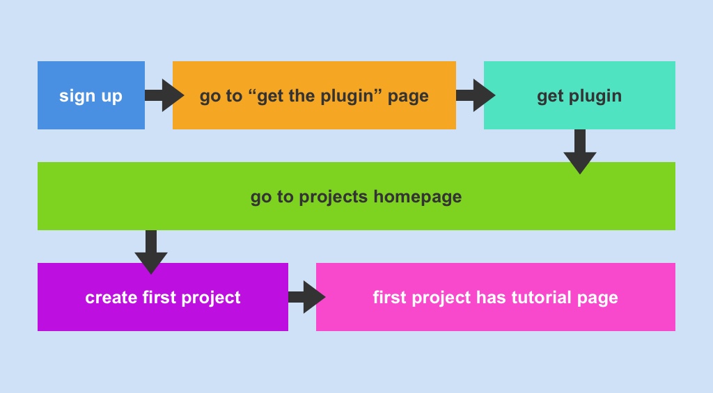
For the first pass at in-app onboarding, we decided we would include a copy of that same example project in every new account. The flow would be something like this:
Version 2: Show Them The Basics
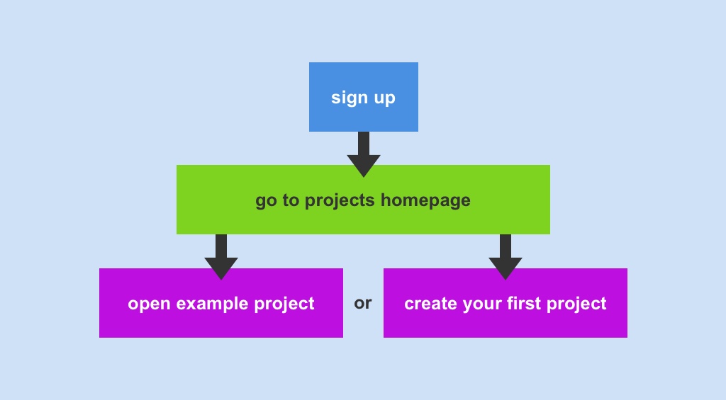
From watching sessions in FullStory, we learned in the first day that this wasn’t really enough. For one thing, many users didn’t even click into the example project, instead they immediately clicked the “Create Project” button (which makes sense; they signed up so they could make moodboards, not to look at someone else’s example project).
For another, whether or not users explored the example project, not a lot of them knew about our Chrome Plugin (which, while not required per se, is critical to using the app; he plugin is how users add images to prsnt from other websites). And basically none of them knew how to use the app.
So, we decided to add a screen to onboarding that explained the basic steps of using prsnt. This screen had three steps: adding images (which included a link to get the plugin), dragging and dropping to rearrange, and saving/printing presentations. The flow was something like this:
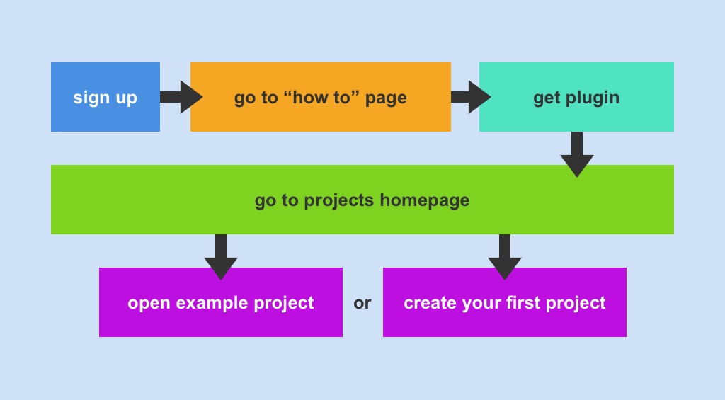
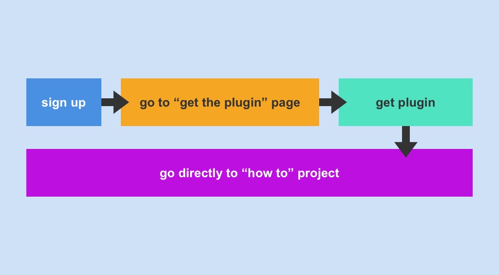
Version 3: It’s All About The Plugin!
It was clear from watching sessions after we made that change, though, that we needed to make the plugin super apparent to new users, above all else. Users were seeing this three-step screen, not clicking the “get the plugin” link, then just proceeding on to the same pitfalls that awaited them before we put the screen there–they would click into the example project and not get it, or they would click to create a project and, well, still not get it.
At the time, the only link to get the plugin in the app was in the settings menu–a place we had shoved it, for lack of a better place to put it, back when we had the luxury of hand-holding all our users through the process. But it was clearly not discoverable here.
So we decided to scrap the three-step “how to” page, and I quickly edited it to be solely about the plugin. The h1 said “Before you get started, grab our Chrome plugin”; the only image on the page showed the plugin in action; and there was a big fat “Get the plugin” CTA button beneath that.
So now the flow looked like:
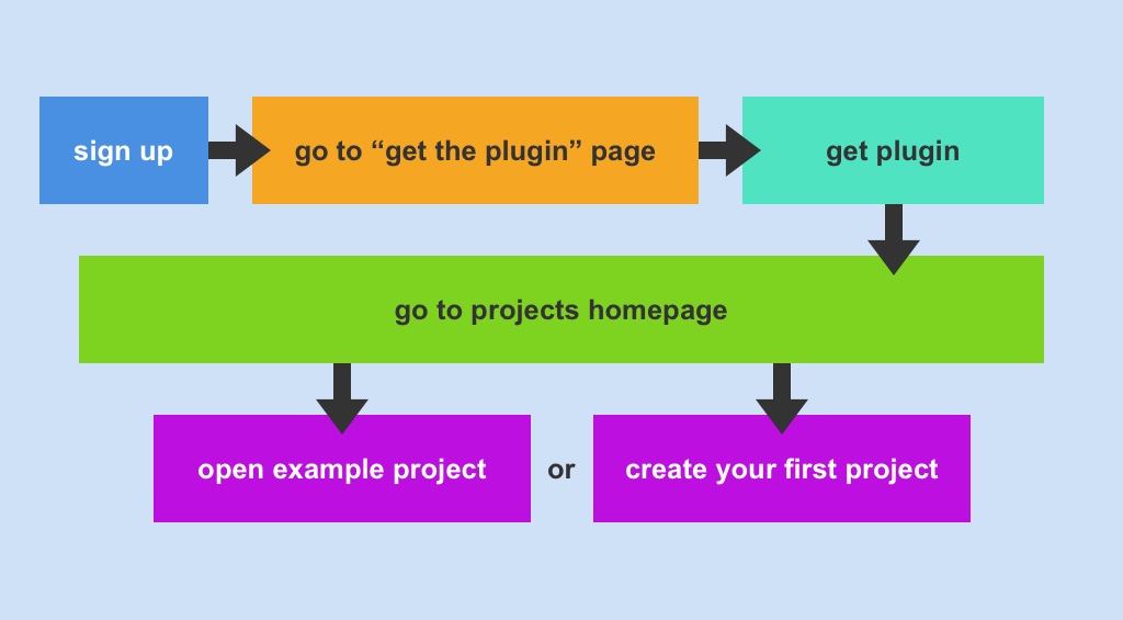
Which worked pretty well, in terms of getting people to add the plugin; but it didn’t solve our “how does this work?” problem.
Version 4: The Medium Is The Message
On a call with an advisor, we struck on a novel idea: we’re already planting an example project in every new account. Why not change that example project into a tutorial on how to use the app?
It was fairly simple to change it; we were already provisioning the example projects in new accounts from a live project in a special account we set up just for managing the example project. All I had to do was go in and change that project. We renamed it to “How to use prsnt.app,” and put in about 15 pages of basic text blocks explaining the different features of the app. (True story: the very first version of that example project was full of dog pics I found on google images. I still don’t know why we thought that was a good idea.) The images in the project were interactive, with CTA text like “crop me to so all four emoji are visible” and “click [x] to remove me from the page”.
We also decided to bring people directly to this example project on signup, instead of bringing them to their projects homepage and letting them choose to click into the project.
So, now we had a flow like this:
Version 5: Skip To The Point
Watching sessions for new users in that flow, it became clear to us that some people just want to get to the damn project making already; many users would land on the example project, and without reading any of the text, start gutting it so they could put in their own images. Deprived of an easy affordance to create a new project form scratch, they were taking our example project and making it into what they wanted.
So we compromised on this: we picked the top 6 things from the “how to” project, and put them all on one page. We titled it “Tutorial Page.” Then we put together one beautiful example page, and titled it “Example - Midcentury Modern Bedroom.” The rest, we deleted. We even included directions on the tutorial page for how to delete the tutorial page, just to make it clear that this was behavior we were willing to accommodate.
We also realized: if it’s just two pages, we dont really need to set up a whole example project for this. So we changed it so that the first project you create in prsnt will include these two pages. Now the flow looks like this: