How I designed the logo for prsnt.app
When we started prsnt.app, we didn’t really have a logo in mind; originally, it was just a hacky prototype that ran on our local machines, with no users, no marketing or public pages, just the core layout manipulation functionality and web-clipping functionality.
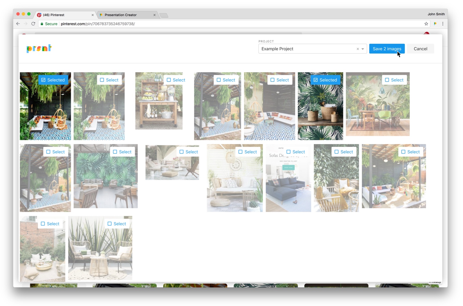
As we started getting interest from potential early adopters, though, we pretty rapidly needed to throw together a hosted version of the app. The very first hosted version at prsnt.app was actually not much more than what we’d run on our macbooks: no user, no login, just a url where you could go and play with the functionality. We shared this with a few early users at interior design firms, but they almost immediately said, “I really want to be able to like, you know, actually do stuff with this.”
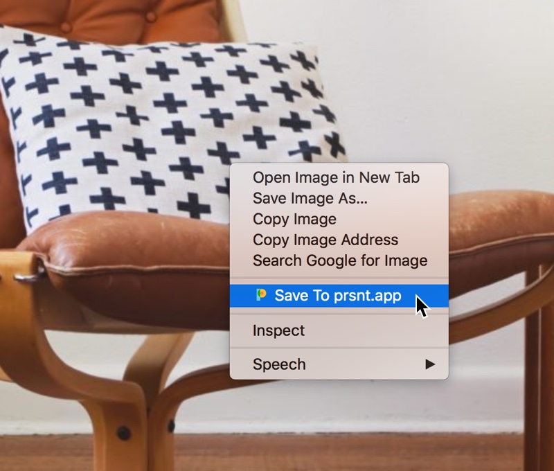
So, we needed some real stuff. We needed accounts. We needed persistent data. We also needed a real version of our web-clipper. Up to this point, it didn’t have a logo, just a solid colored square placeholder; it was also not distributed via the Google Chrome Webstore yet at that point. So I set out to make a placeholder logo.
The placeholder
The placeholder logo I made was really just a brand color + concept mashup. I took the FontAwesome icon for a desktop computer screen, and put the FontAwesome icon for a cloud over it. I made the frame of the screen and the cloud both our accent/link/button color, and called it a day. It suggested cloud-based display or presentation, and it matched the colors we used on the site. I shipped it and moved on to other concerns.

We used this logo as the favicon for the site, as the icon for the Chrome plugin, and as the navbar brand icon for the first couple months of prsnt. But it was not really that inspiring; it was, to borrow a word from The Simpsons, perfectly cromulent, but no one looked at it and thought, “oh cool.” A few days after I put this logo out, I made a ticket for myself in Jira that just said, “Make real logo???”
Making a real logo
By early August, we had several early adopters in our closed beta, and the app was getting pretty mature. We were preparing for a public launch, including marketing campaigns. We wouldn’t have an opportunity to talk the app up to people and prepare them for it the way we did with our hand-picked early adopters.
I knew we needed the new logo to have some important characteristics:
- visually distinctive
- friendly
- implying creativity
- implying simplicity
So I set to work in sketch. I’d toyed a lot of times in the past with typography design, so I was naturally drawn to try making a logo font for prsnt. I tried to limit myself to primitive shapes: circles, rectangles and triangles only.
Striking the right balance of colors was tricky; in the first attempt, red was too prominent as the bowl of the “p”, the arm of the “r” and the shoulder of the “n”. Plus, red + blue doesn’t make green, so this felt a little too unnatural.
Similarly, I had trouble finding the right color balance in the simplified third attempt (middle column in the image above); when I removed the couners from the bowl of the “p” and the shoulder of the “n”, I lost the opportunity to include red. I tried to fix this by making the stems of the “r” and “t” red, but that looked off; plus, this introduced a fifth color, purple (since I was overlapping blue and purple).
I decided to explore the possibilities of purple (see the furthest right column), but found it tough to justify a 5-color palette when trying to keep things simple; primary colors only.
In the end, I went with the second column from the left. the inverted horseshoe that makes the collar of the “n” still creates a physics-defying color combination with its stem; red + blue still doesn’t make green. But I wanted to leave it like this for a few reasons. First, as I mentioned above, I wanted to only use primary colors. Second, I felt that the balance of colors was better when I used red for the collar of the “n,” because otherwise it would only be present in the counter of the “p” and the top curve of the “s”. Third (and this is sort of one of those post hoc justifications), it’s sort of an implied magic. The new prsnt.app logo is defying physics!
The final logo is used as the favicon on the site, as the icon for our Chrome plugin, and as the navbar brand icon. Just the leading “p” is used in most cases, with the full logo used on the homepage in in the navbar on the site.